Vitamin Water
Vitamin Water
From cluttered to clean: a fresh take on a refreshing and familiar favorite.
Client
Class Project
Year
2024
Category
Packaging Design
About
About
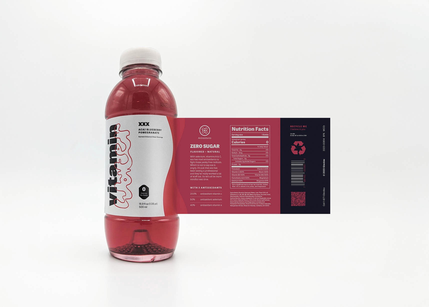
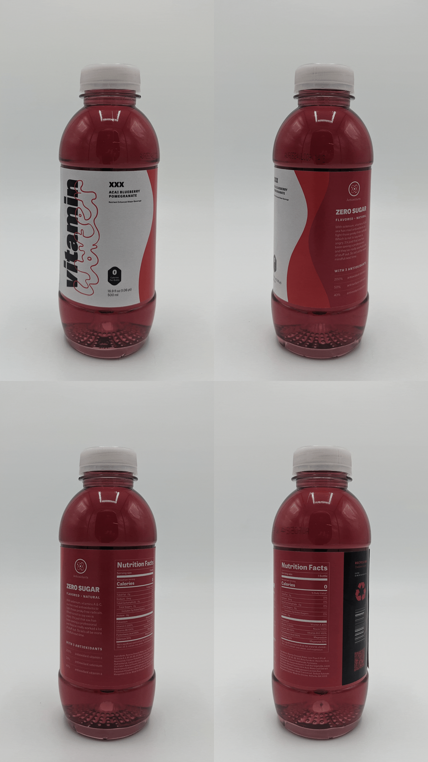
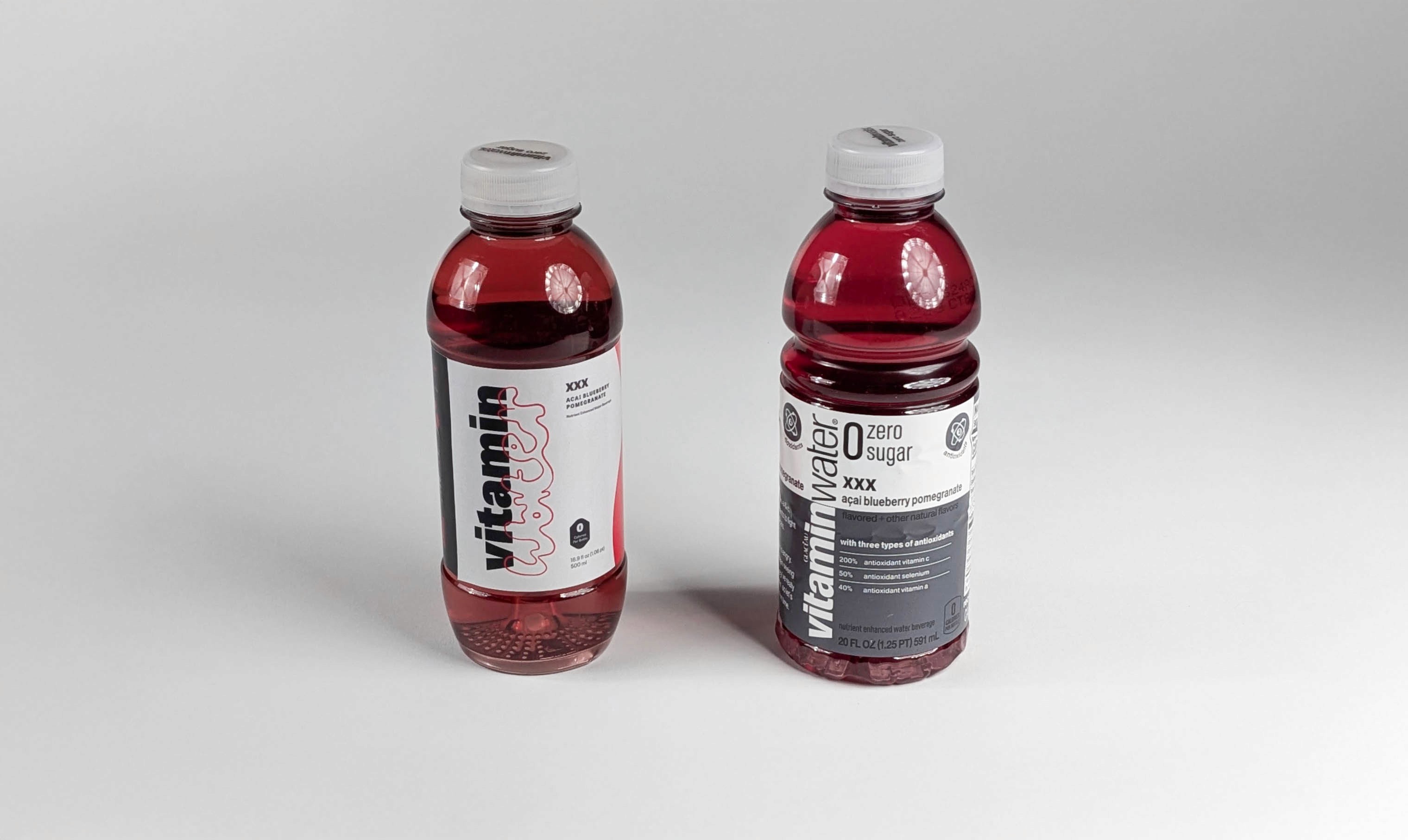
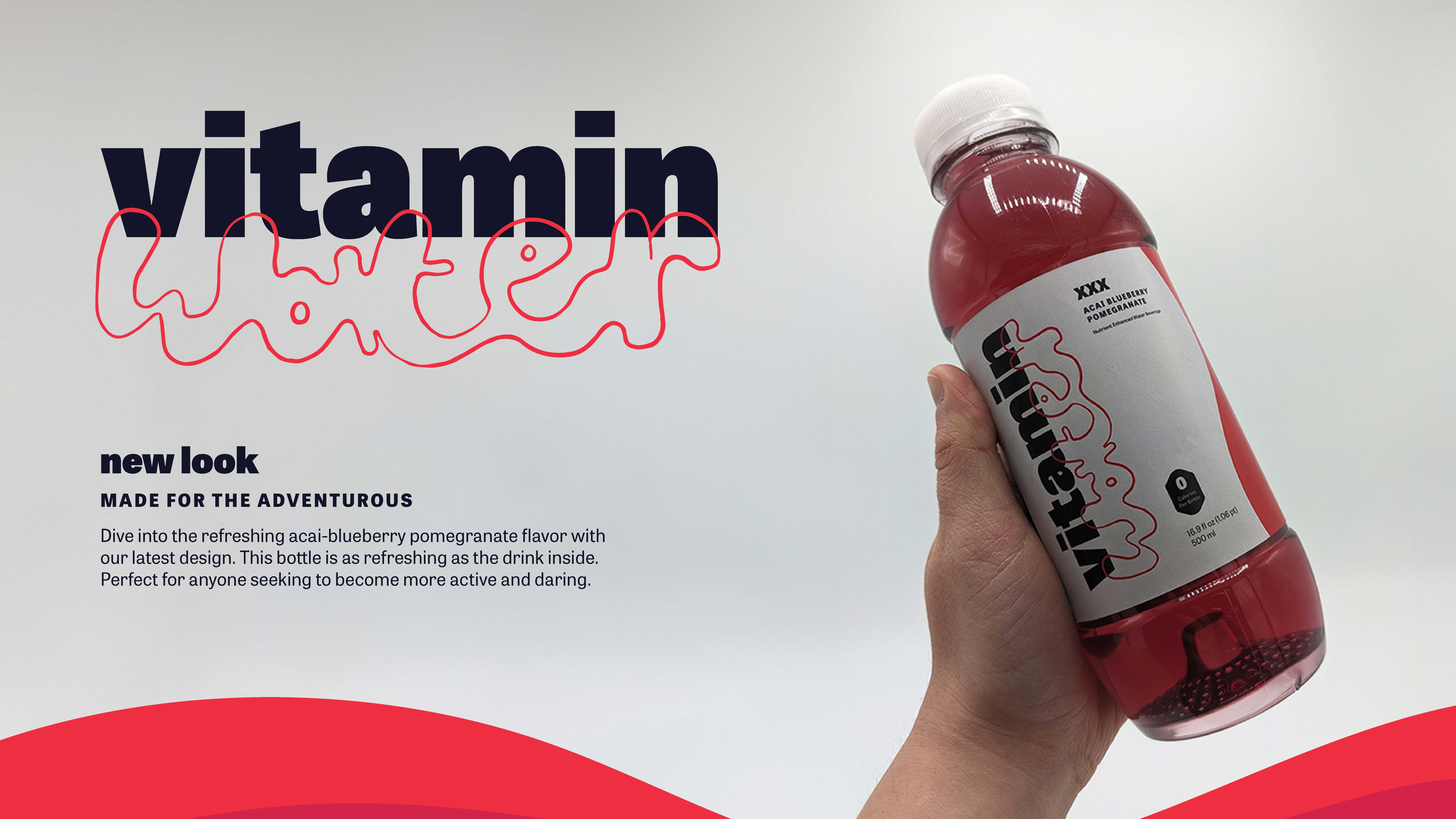
This project began with my frustration toward the original Vitamin Water label, which I found visually cluttered and hard to engage with. Inspired by people like my mom—who cares deeply about health and pays attention to the details—I reimagined the design to feel more modern, clean, and approachable. The updated label features an organized typographic layout, refreshed graphics, contemporary fonts, and a hand-drawn wordmark that adds personality.
This project began with my frustration toward the original Vitamin Water label, which I found visually cluttered and hard to engage with. Inspired by people like my mom—who cares deeply about health and pays attention to the details—I reimagined the design to feel more modern, clean, and approachable. The updated label features an organized typographic layout, refreshed graphics, contemporary fonts, and a hand-drawn wordmark that adds personality.
About
This project began with my frustration toward the original Vitamin Water label, which I found visually cluttered and hard to engage with. Inspired by people like my mom—who cares deeply about health and pays attention to the details—I reimagined the design to feel more modern, clean, and approachable. The updated label features an organized typographic layout, refreshed graphics, contemporary fonts, and a hand-drawn wordmark that adds personality.
Concept
Concept
This rebrand focuses on clarity, simplicity, and trust—three qualities that the original packaging lacked. I wanted the design to feel as intentional as the health choices made by its target audience. By stripping away visual noise and introducing a clearer hierarchy, the new design invites the consumer in rather than overwhelming them. Every element, from typography to illustration, was chosen to reflect a more thoughtful and wellness-oriented approach that better speaks to modern, mindful shoppers.
This rebrand focuses on clarity, simplicity, and trust—three qualities that the original packaging lacked. I wanted the design to feel as intentional as the health choices made by its target audience. By stripping away visual noise and introducing a clearer hierarchy, the new design invites the consumer in rather than overwhelming them. Every element, from typography to illustration, was chosen to reflect a more thoughtful and wellness-oriented approach that better speaks to modern, mindful shoppers.
Concept
This rebrand focuses on clarity, simplicity, and trust—three qualities that the original packaging lacked. I wanted the design to feel as intentional as the health choices made by its target audience. By stripping away visual noise and introducing a clearer hierarchy, the new design invites the consumer in rather than overwhelming them. Every element, from typography to illustration, was chosen to reflect a more thoughtful and wellness-oriented approach that better speaks to modern, mindful shoppers.
More Works More Works
More Works More Works
Design & Illustration
GO BACK TO TOP
Design & Illustration
GO BACK TO TOP