Branding
Branding
At TLO, strong visual branding is essential to expressing our mission of innovation, research, and entrepreneurship. From internal assets to public-facing campaigns, cohesive design plays a key role in communicating both credibility and creativity. This section highlights brand systems developed to unify messaging, build recognition, and support those working within and alongside the office.
Client
U of U Technology Licensing Office
Year
2023-2025
Category
Visual Identity Systems & Logos
About
About
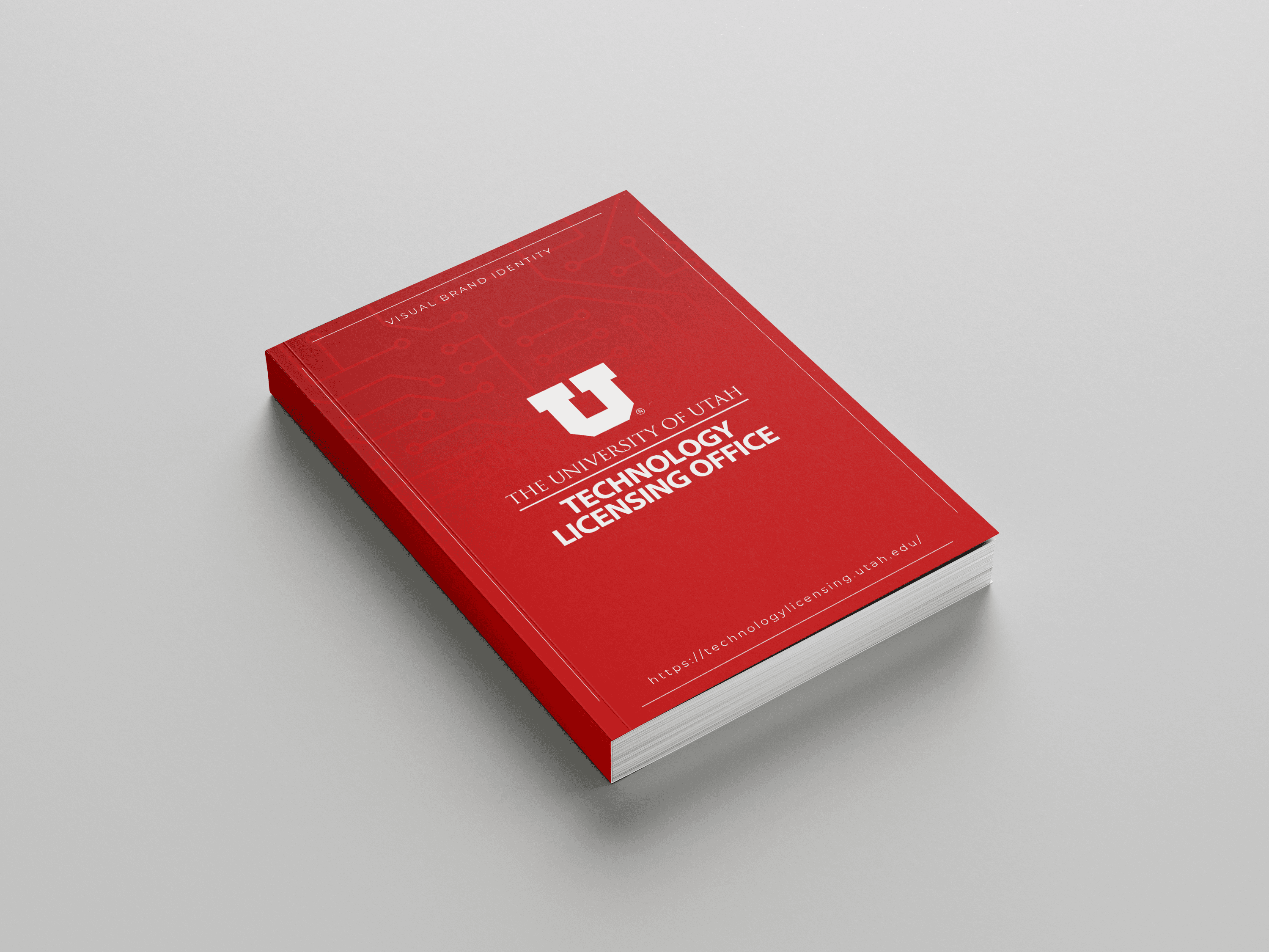
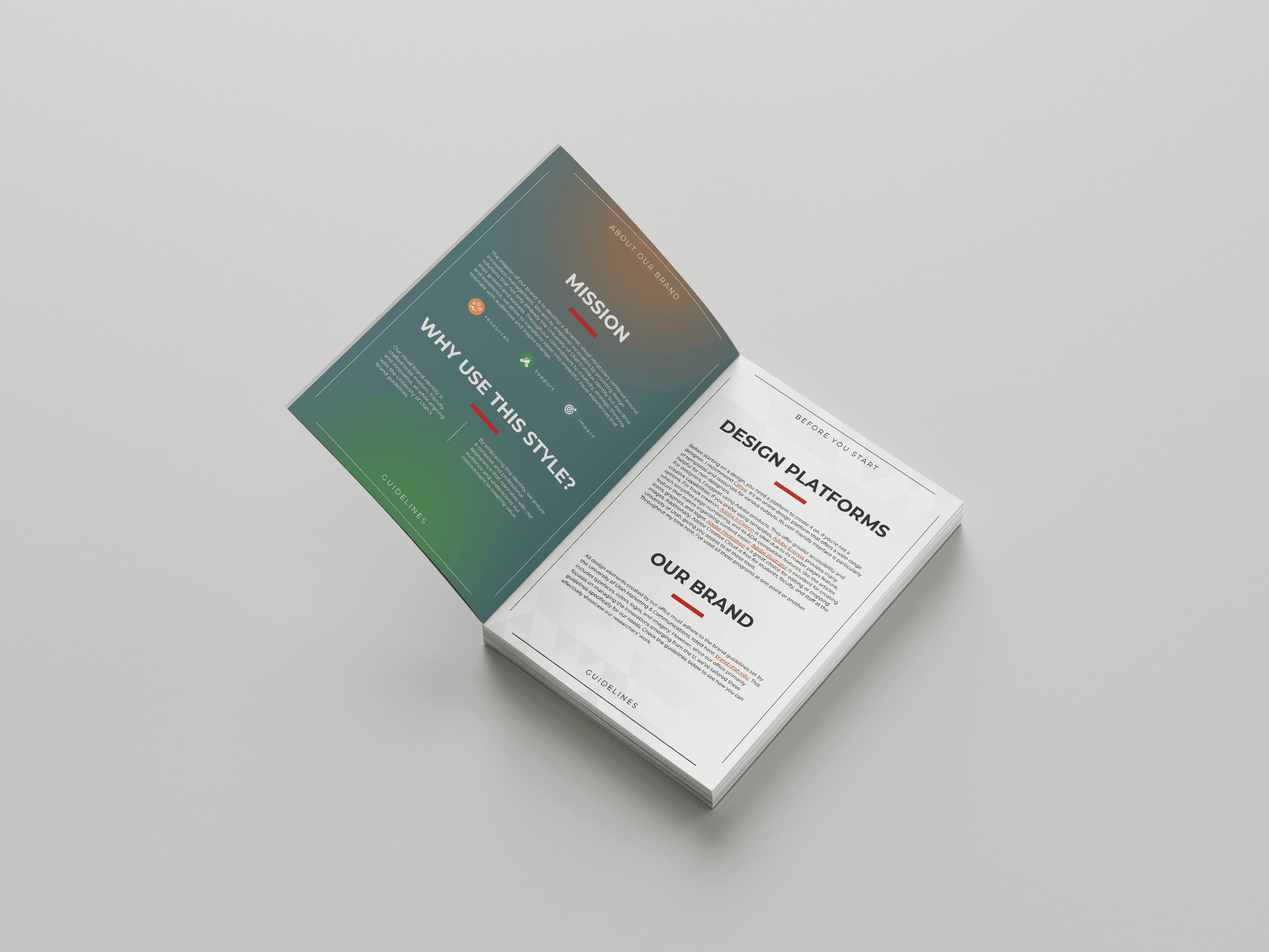
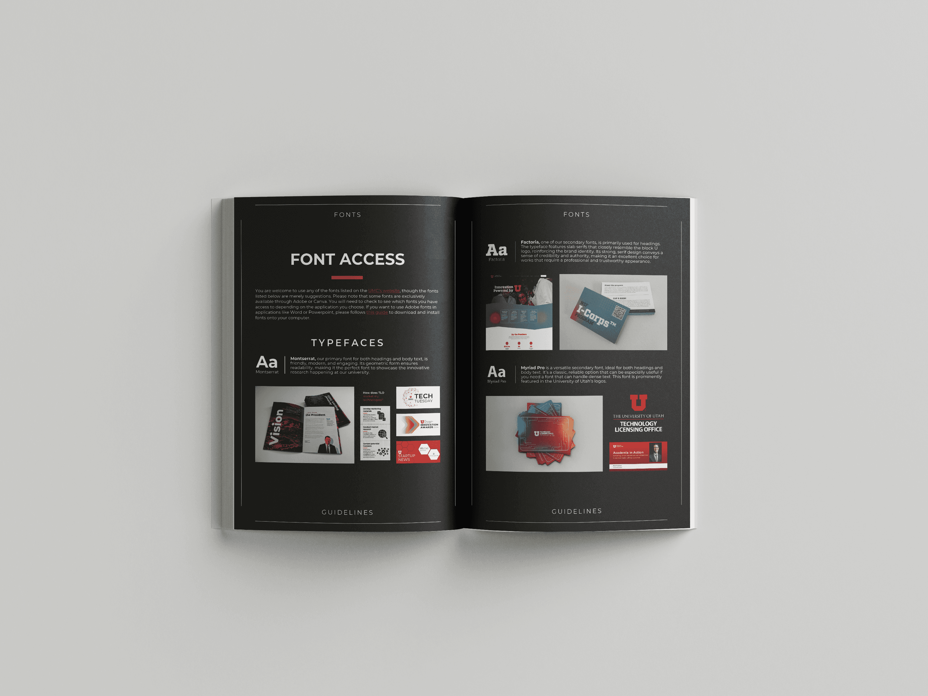
The Visual Brand Identity Guide for the Technology Licensing Office was built from the ground up to reflect the office’s focus on innovation management while aligning with the broader University of Utah brand. The guide includes tailored typography, color systems, iconography, photography principles, and templates—along with recommendations for design tools and accessibility. Designed as a practical resource, it empowers non-designers and designers alike to create on-brand materials that showcase research, programs, and events clearly and consistently.
The U Startup Launchpad brand was created to support a new initiative aimed at helping university innovations move from lab to market. This identity includes a custom logo, color palette, and typography system Created to reflect the innovative spirit of startups while staying rooted in the university’s academic foundation. The visual language reflects the core principles of startup success—highlighting momentum, diversity of resources, and clarity of purpose.
The Visual Brand Identity Guide for the Technology Licensing Office was built from the ground up to reflect the office’s focus on innovation management while aligning with the broader University of Utah brand. The guide includes tailored typography, color systems, iconography, photography principles, and templates—along with recommendations for design tools and accessibility. Designed as a practical resource, it empowers non-designers and designers alike to create on-brand materials that showcase research, programs, and events clearly and consistently.
The U Startup Launchpad brand was created to support a new initiative aimed at helping university innovations move from lab to market. This identity includes a custom logo, color palette, and typography system Created to reflect the innovative spirit of startups while staying rooted in the university’s academic foundation. The visual language reflects the core principles of startup success—highlighting momentum, diversity of resources, and clarity of purpose.
About
The Visual Brand Identity Guide for the Technology Licensing Office was built from the ground up to reflect the office’s focus on innovation management while aligning with the broader University of Utah brand. The guide includes tailored typography, color systems, iconography, photography principles, and templates—along with recommendations for design tools and accessibility. Designed as a practical resource, it empowers non-designers and designers alike to create on-brand materials that showcase research, programs, and events clearly and consistently.
The U Startup Launchpad brand was created to support a new initiative aimed at helping university innovations move from lab to market. This identity includes a custom logo, color palette, and typography system Created to reflect the innovative spirit of startups while staying rooted in the university’s academic foundation. The visual language reflects the core principles of startup success—highlighting momentum, diversity of resources, and clarity of purpose.
Concept
Concept
Both branding systems were designed to be scalable, inclusive, and easy to apply across mediums. For the Visual Brand Identity Guide, the focus was on clarity, usability, and accessibility—ensuring that everyone in the office could create materials that were ADA-compliant and aligned with the University of Utah’s standards. It provides a toolkit for consistent communication, from internal slides to public-facing banners.
The U Startup Launchpad brand was created to feel bold, approachable, and aspirational. The logo—a rocket with a multicolored trail—symbolizes the key pillars of the program: education and training, startup formation services, and fast-track licensing. Each color represents one of these essential components, unified in motion to reflect the path from research to real-world impact. Designed within the University’s visual system, it expands the brand’s energy while staying grounded in its identity.
Both branding systems were designed to be scalable, inclusive, and easy to apply across mediums. For the Visual Brand Identity Guide, the focus was on clarity, usability, and accessibility—ensuring that everyone in the office could create materials that were ADA-compliant and aligned with the University of Utah’s standards. It provides a toolkit for consistent communication, from internal slides to public-facing banners.
The U Startup Launchpad brand was created to feel bold, approachable, and aspirational. The logo—a rocket with a multicolored trail—symbolizes the key pillars of the program: education and training, startup formation services, and fast-track licensing. Each color represents one of these essential components, unified in motion to reflect the path from research to real-world impact. Designed within the University’s visual system, it expands the brand’s energy while staying grounded in its identity.
Concept
Both branding systems were designed to be scalable, inclusive, and easy to apply across mediums. For the Visual Brand Identity Guide, the focus was on clarity, usability, and accessibility—ensuring that everyone in the office could create materials that were ADA-compliant and aligned with the University of Utah’s standards. It provides a toolkit for consistent communication, from internal slides to public-facing banners.
The U Startup Launchpad brand was created to feel bold, approachable, and aspirational. The logo—a rocket with a multicolored trail—symbolizes the key pillars of the program: education and training, startup formation services, and fast-track licensing. Each color represents one of these essential components, unified in motion to reflect the path from research to real-world impact. Designed within the University’s visual system, it expands the brand’s energy while staying grounded in its identity.

More Works More Works
More Works More Works

Digital Work
Ads, Infographics & Social Media
2023-2025
2023-2025
Digital Work
Ads, Infographics & Social Media
2023-2025
2023-2025
Digital Work
Ads, Infographics & Social Media
2023-2025
2023-2025
Digital Work
Ads, Infographics & Social Media
2023-2025
2023-2025

Print Marketing
Banners, Brochures, Flyers & Rack Cards
2023-2025
2023-2025
Print Marketing
Banners, Brochures, Flyers & Rack Cards
2023-2025
2023-2025
Print Marketing
Banners, Brochures, Flyers & Rack Cards
2023-2025
2023-2025
Print Marketing
Banners, Brochures, Flyers & Rack Cards
2023-2025
2023-2025
Design & Illustration
GO BACK TO TOP
Design & Illustration
GO BACK TO TOP